Imagine you’re at a vintage store. After a minute of window shopping, you’re drawn to a fancy silk shirt. You check its price tag, and since you see it’s quite expensive – $150 – you put it back on the rack. However, determined to find something similar and cheaper, you continue with your search, only to find that other shirt prices range between $500-850. What do you do next? You go back to your first find and buy it. Know why? Because of a cognitive bias called anchoring.
Anchoring is the fact that people tend to cling on to the first piece of information (or anchor) they encounter, and let their subsequent actions, such as estimates, arguments, and conclusions, be made in relation to it. Think of it as a shortcut or heuristic our brain takes to speed up the decision-making process.
In the above example, the leading anchor was the $150 price tag, which helped you make a price comparison and conclude that the $150 shirt’s a steal!
Origin of Anchoring Bias
Back in 1974, Kahneman and Tversky conducted a study in which one group of high school students was asked to estimate the result of 1x2x3x4x5x6x7x8, and the other group was asked to calculate 8x7x6x5x4x3x2x1. They had only five seconds to answer.
Now, although the answer to both questions is 40,320, the groups gave different answers. The first group’s median estimate was 512, while the second group’s median estimate was 2,250. What’s the reason behind this big a difference?
Basically, faced with a time limit, participants quickly anchored to the product of the first few numbers of the mathematical expression (1x2x3=6 & 8x7x6=336), which then influenced their estimates: a smaller number for an ascending sequence and a bigger answer for a descending sequence. Ultimately, this experiment proved Kahneman and Tversky’s prediction that people rely on the initial cue to make estimates, even though it may result in an error in judgment.
Examples of Anchoring Bias in Action
Let’s look at how some brands use the Anchoring Bias to appear affordable and increase the perceived value of their products and services.
#1: Display Original and Discounted Prices Next to Each Other
We often rely on the price of a product to determine its worth. Expensive products, for instance, are assumed to be excellent quality, stylish, long-lasting, and hence worth buying. And this is exactly the reason why we’re tempted to buy them for much less on sale.
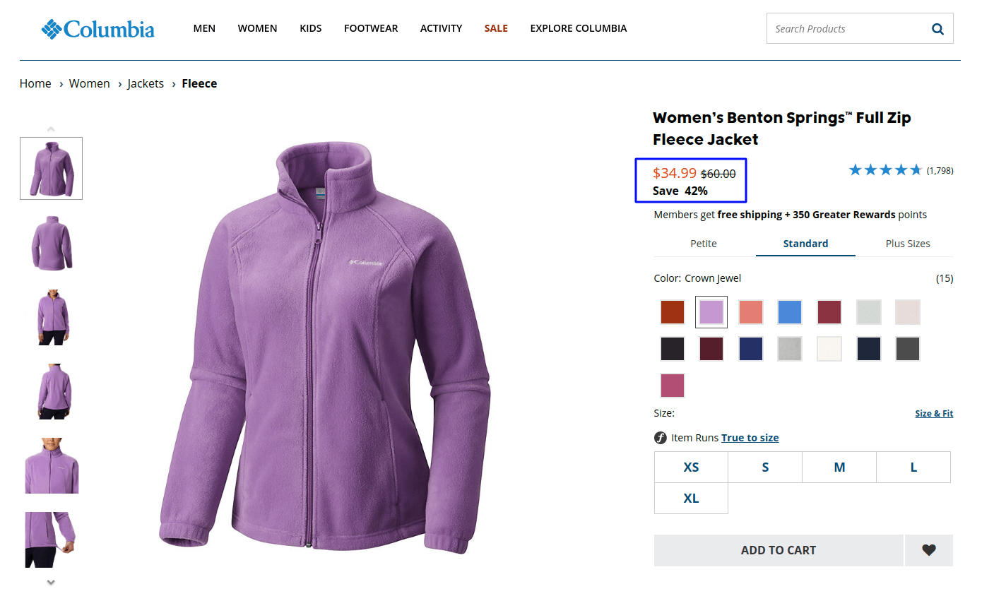
Here’s an example from the Columbia website where the original price is struck off, anchoring users to consider the discounted price as a good bargain.
Note: The Anchoring Effect can backfire if there’s a ridiculous gap between the original and discounted price. For example, wouldn’t you be suspicious if I propose selling you a brand new BMW whose actual price is $45,000, for $8,000?
#2: Offer a Suggestion
Ever noticed transparent donation boxes for various charities at checkout counters in stores and eating joints? How do you decide how much to give? My guess is you’ll look at the most popular bills in the box. After all, with people from behind the counter looking at you, you want to make sure you come across as a person with a big heart and an equally big wallet!
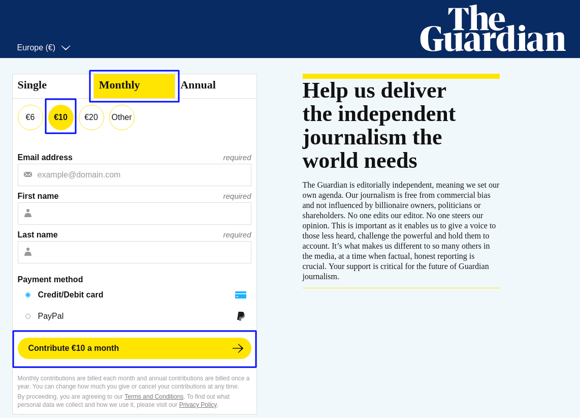
But unlike in the example above, it’s a good idea to take cognitive load off a customer’s mind. Notice how the folks at The Guardian manage that. The default contribution value works as an anchor, hinting it’s a popular option, thus making people conform to it. Whether people donate the recommended amount or not is a different matter, but, at least they have a number to adjust to.
#3: List the Most Expensive Plan First
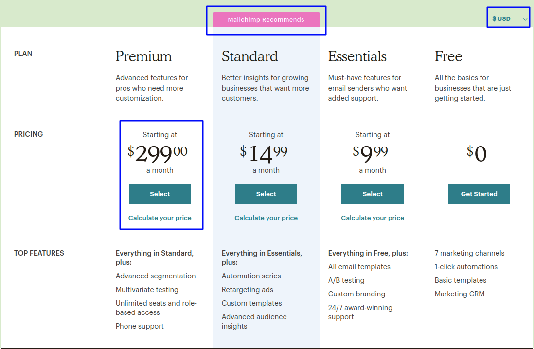
Agreed it’s not quite the trend, but this Conversion XL study might convince you to change your tactics. Not only did they find out that ordering pricing plans from high to low results in higher revenue, but another of their studies revealed how highlighting a recommended plan results in even greater results.
MailChimp does both. Straight off the bat people anchor to the expensive plan, which makes other options more appealing in comparison.
Another reason this strategy works is the operative rejection-then-retreat technique. Robert Cialdini talks at length about it in his book, Influence. Essentially, you make a larger-then-smaller request so that even if someone rejects it at first, guided by the reciprocity principle, they’ll give in to the next request.
To prove it works, he cites a report wherein billiard table dealers were able to increase the average table sales by 50% by first showing the expensive models and then allowing customers to shop the rest of the collection. Suffice it to say that by organizing your plans from high to low, your prospects are bound to see the mid-price options more favorably.
#4: Leverage Multiple Unit Pricing

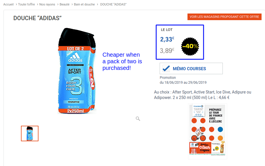
It’s a pricing technique where you offer a lower price per unit if someone buys a product in bulk. For example, a set of three mason jars for $5 instead of $2 for each.
The main purpose is to get people to anchor on the money-saving aspect. It makes the offer tempting and convinces them to buy more units even when they don’t actually need them. Supermarket giants have been capitalizing on this for years. An example from the E.Leclerc website below:
Other Cognitive Biases Used In Conversion Rate Optimization
Bandwagon Effect
People’s tendency to do something merely because others are doing it, irrespective of whether they agree or not, is what psychologists called the Bandwagon Effect.
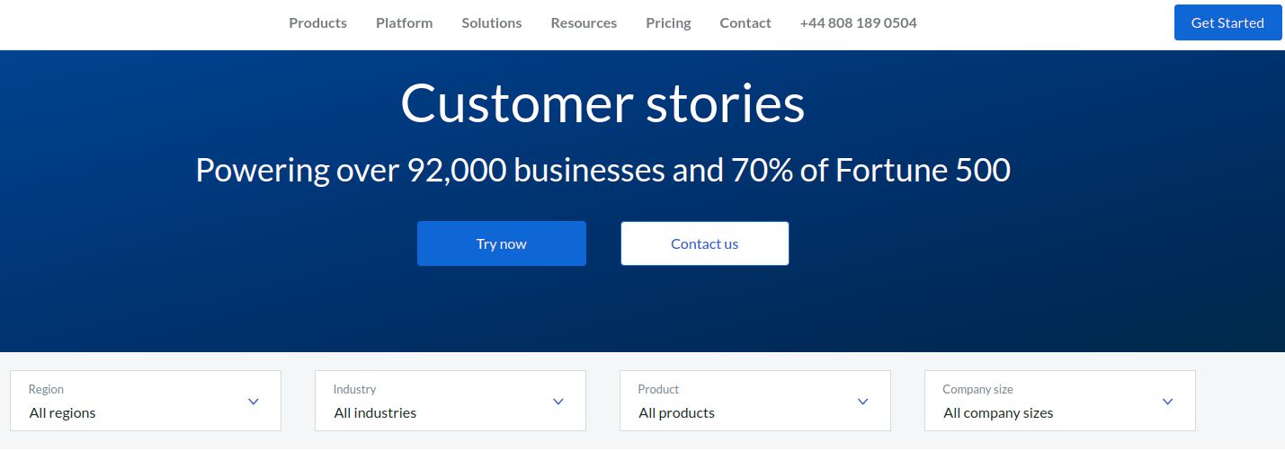
One of the best ways you can harness its conversion optimization benefit is by using social proof on your website. Display how many businesses you cater to, your client names, ratings, reviews, and testimonials to establish credibility and influence prospects to ‘hop onto the bandwagon’. Take a cue from the company Box on how to drop numbers and names.
Barnum Effect
It’s a psychological phenomenon whereby people accept vague and generic statements as accurate descriptions of their own personalities, without thinking they could be applicable to other people, too.
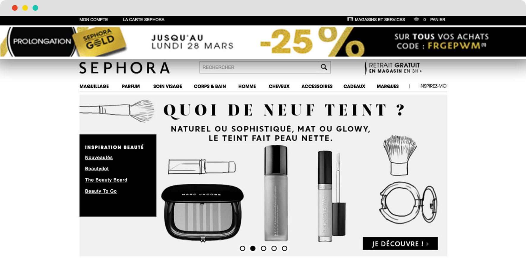
You, too, can trigger this bias by personalizing user experience. Your prospects will feel unique and heard, when, in reality, you’re appealing to a whole segment, not one person. Think about personal recommendations based on visitor segmentation.
At AB Tasty, we ran a campaign for one of our clients, Sephora, that involved running a personalized, promotional banner exclusively for loyalty card holders. And guess what? The banner led to a 16% increase in transaction.
Framing Effect
The Framing Effect is a cognitive bias where people make decisions based on how information is presented to them as either a gain or a loss.
Generally speaking, people avoid risk when the option is positively framed, but become more risk-averse when a negative frame is brought into the picture. Why? Since the pain of losing something is felt much more than the happiness upon gaining something.
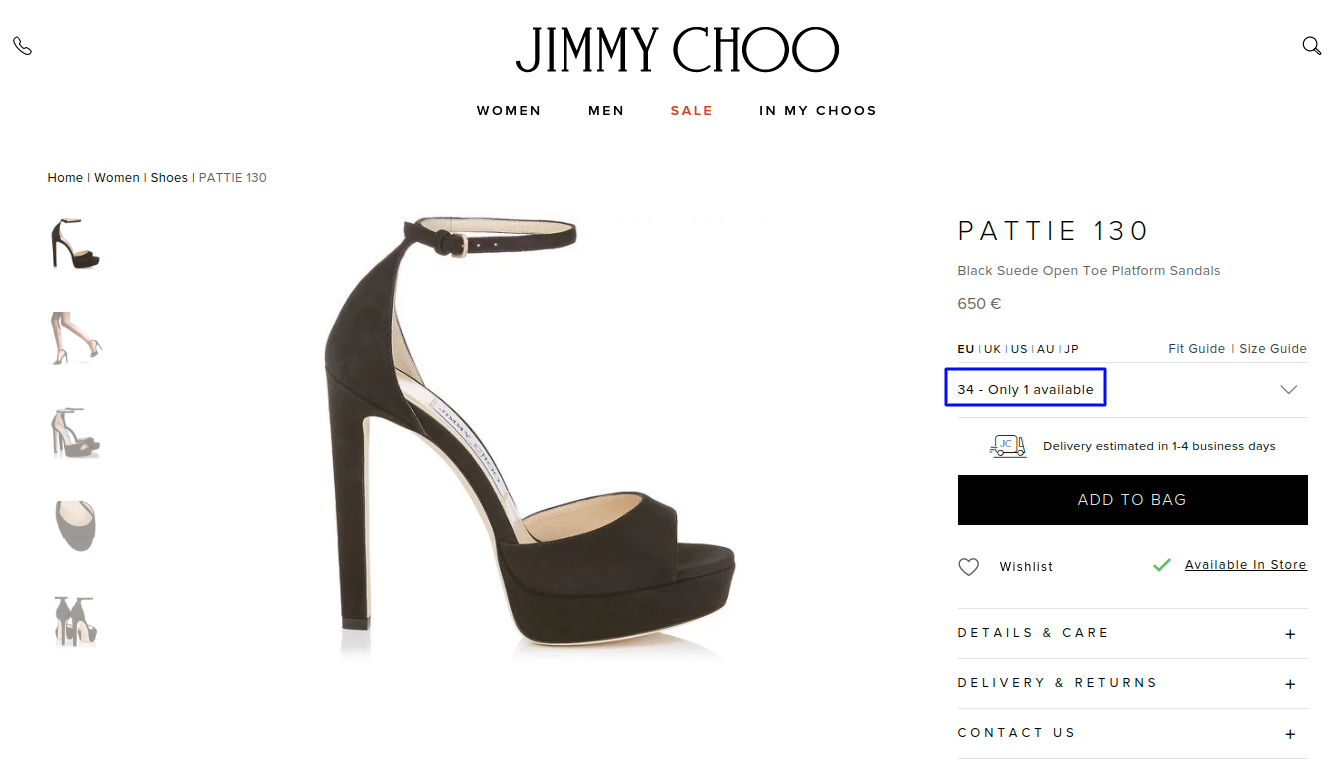
To capitalize on this psychological quirk, use urgency to frame the experience for your visitors. You can shine the spotlight on real-time stock levels, the time ticker, or competition. The intention is for visitors to notice the inevitable loss and avoid it, come what may!
Peak-End Rule Effect
Peak-End Rule Effect is a convenient cognitive shortcut our brain takes to recall an experience as good or bad based on how we feel at the peak (when emotions are intense) and at the end of the event.
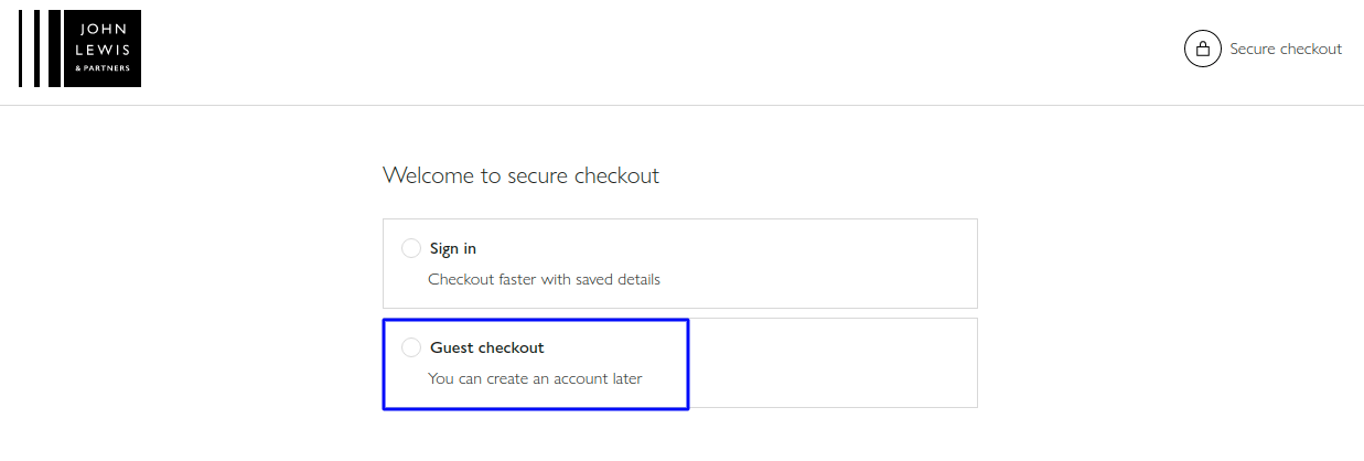
From a CRO point of view, this means the focus should be on creating a user journey that concludes on a high note. For instance, at the checkout stage, don’t force registration, rather give visitors the guest checkout option, to lessen any potential for frustration.
Get Ready To Trigger Anchoring Bias
It’s an excellent psychological tactic to boost your product’s perceived value and influence buyers’ decision-making journey. But first, you’ll need to create anchors that spark a favorable response from your consumers. You may not perfect it in one go, which is why it’s recommended you never stop A/B testing.

