Website heatmaps are visual representations of attention, engagement, and interactions generated by your visitors as they navigate through your website. Free or paid tools help you generate different maps to better understand user behavior and optimize conversions.
What is a heatmap?
Heatmaps are visual representations of attention, engagement, and interactions generated by your visitors as they navigate through your site. Warm colors indicate areas that attract the most attention or engagement, whereas cool colors show overlooked spots on the page.
Let your own visitors show you the areas of improvement on your site to help you boost sales, then simply make the appropriate changes and measure how well it’s working.

When to use heatmaps?
Heatmap tools measure attention, engagement and even number of clicks on your website. They are a key component to your optimization toolkit (to learn more, read our complete guide to Conversion Rate Optimization).
To give you some concrete examples, here are some of the main reasons to use these softwares:
- To measure engagement. Do you write online articles, and wonder up until what point your audience stops reading? Using a heatmap can help you visualize the ‘scroll’ of a user, and where they interact with your site. If you notice that only a tiny percentage of people actually reach your CTA, it might be time to make a change.
- To measure actions. Where do my visitors click? Are they clicking the right button? Heatmaps help you see if your visitors are completing your desired actions, and also highlight where they might be getting stuck.
- To measure attention. What headlines attract the most attention? What images attract the most attention? What elements are distracting from the main content? Do my visitors see my form? Once you have solid answers to these questions, you can start making changes that will increase your conversion rates.
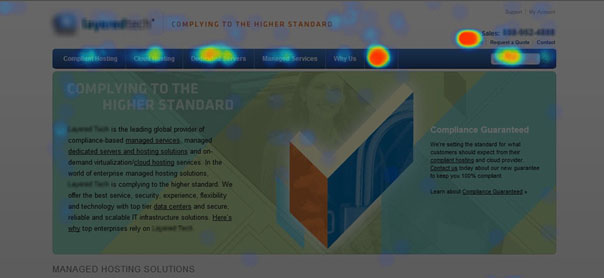
Gaining the answers to the above questions can help you answer even more nagging questions:
- Where should I place my most important content?
- What’s the best way to use images and videos?
- Where are my visitors getting distracted?
- Where should I talk about my product/service?
Most heatmap softwares will let you generate maps that show user interactions from different points of view. The idea is that you should refer to all of them in order to reveal your visitors’ behavior.
Clickmap
This type of map allows you to quantify actions. It’s a visual representation of all of the clicks visitors make on your page. This ‘map’ generates precious data since it allows you to see precisely where people interact with your site.
Each time someone clicks on a precise area on a page, the heatmap marks the spot with a light dot. If you see large areas of white, this is where the majority of visitors are clicking.
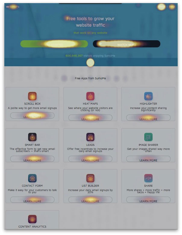
By quickly identifying the ‘hot spots’ on your site, you can immediately tell if people are clicking where you want them to click. On the above image from Sumo, we can see that the ‘SHARE’ and ‘IMAGE SHARER’ are the least popular areas.
Scroll heatmap
The scroll-map lets you see how far down a page visitors scroll, and especially: what elements attract their attention and what do they linger on?
By using a scroll-map, you can determine if users ‘see’ the right parts of your site, or if they get distracted by unimportant elements.
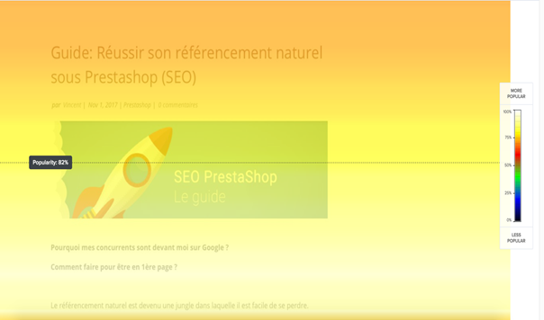
If we look at the above screenshot of an article that talks about SEO, we can see that the image and the two lines of text below it are the most popular: about 85% of visitors have seen these elements.
Percentage of clicks heatmap
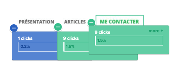
The ‘percentage of clicks’ heatmap compliments the classic one. It lets you see, element by element, how many clicks were generated by a certain image or CTA. The ability to quantify clicks by element is extremely important.
This allows you to:
- Understand how much importance users give to each element
- Avoid allowing users to click on images without links
Confetti heatmap
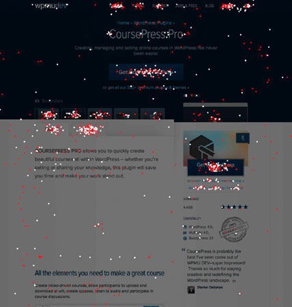
The confetti heatmap lets you see each individual click on a page, as opposed to a view that shows a ‘density’ of clicks. It allows you to see if people are trying to click on non-clickable areas, and to fix the problem if so!
Heatmap vs. eye-tracking
If heatmaps rely mostly on tracking a user’s mouse movements and clicks, eye-tracking analyzes their gaze.
The point of eye-tracking is to see exactly how your site users look at your site, to analyze the zones where they pay the most attention.
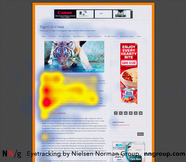
As with heat mapping, the areas highlighted in warm colors show the areas where readers pay the most attention.
Although it’s certainly useful, eye-tracking relies on technology that’s a bit more difficult to put in place. It requires specific equipment that most agencies don’t have.
If you’re interested in eye-tracking, there is software based on AI, like Feng-Gui or EyeQuant, that allow you to simulate eye-tracking with the help of algorithms.
Heat mapping tool features
When looking for a heatmap tool, keep in mind the following points:
- Segmentation: The tool should allow you to create heatmaps specific to certain audiences that you define using certain targeting and segmentation criteria (ex. new visitors, visitors who have converted, visitors from sponsored link campaigns…)
- Map Comparison: You should be able to easily and visually compare the results of different maps from different user segments.
- Page Template: Having a heatmap specific to each page can make the analysis tricky if your page is an ecommerce product page, and you have hundreds or even thousands of them. You need to be able to aggregate results for all pages of a certain type.
- Responsive Heatmaps: The tool has to work on pages accessed from a mobile device. Actions specific to these devices should be recorded, such as touches, scrolls, and swipes. During the analysis, you should be able to distinguish between behaviors and navigation sessions seen on mobile vs desktop devices so that you can correctly interpret the data.
- Exportable Maps: This important feature lets you easily share your results with teammates.
- Dynamic Heatmaps: You should be able to see clicks on dynamic elements: drop-down menu, slider, carousel, elements loaded using AJAX or using a JavaScript framework like React.js or Angular.js.
- Retroactive Heatmaps: Has your site design changed since your last analysis? Your software should be able to conserve previous results as shown on the then-current website design, and not simply superimpose the results on your new design – the results wouldn’t make any sense.
Combine heatmap and A/B testing
Let’s imagine that you’ve used a heatmap to better understand how your website users interact with your brand. You’ve identified strong and weak points on your site, and you’d like to make the appropriate changes.
Question: How can you measure how effective these changes were? There’s only one solution – A/B testing your modifications.
The idea is to create different versions of your web pages, ads, landing pages, etc. in order to compare how they perform.
By combining heatmap and experimentation, you’ve got yourself a 3-step method to:
- Identify problems
- Test potential solutions
- Choose the highest performing solution
On this home-repair website, a preliminary heatmap reveals that users’ attention and engagement are split between too many competing elements.
Insight: attention is divided and conversion is low.
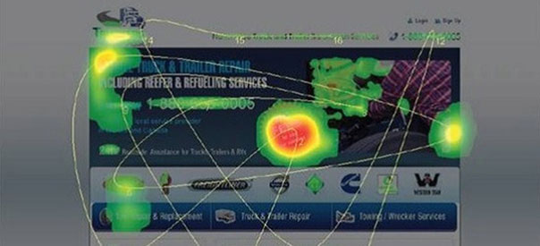
With the help of A/B testing, the company made a few changes to the home page in order to refocus visitor attention on one call-to-action.
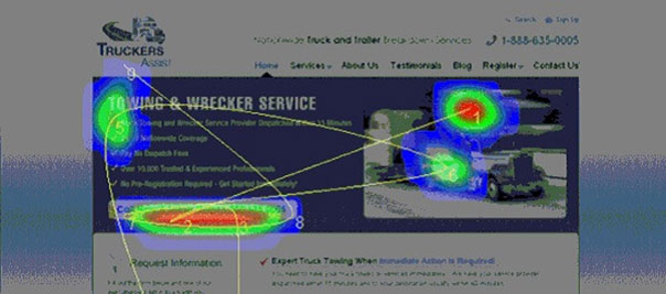
A second heatmap is made after the modifications.
Insight: attention is refocused on the phone number, the main call-to-action, and conversions increase.
To sum up, use heatmaps and A/B testing to:
- Analyze visitor behavior and engagement
- Reveal strong and weak areas on certain web pages
- Find specific ways of increasing conversion rates
- Test these solutions until you see your conversion rates go up


